Color Psychology for Women’s Interiors: Choose Moods That Fit
 Nov, 6 2026
You walk into a room and instantly feel calm. Or maybe you feel agitated, or suddenly hungry. That reaction isn't magic; it's biology meeting environment. Color psychology is the study of how hues affect human behavior and emotions. In interior design, it’s the secret weapon that turns a generic apartment into a sanctuary tailored to your specific mental needs.
Most people pick paint colors based on what looks nice in a swatch book. But if you want a home that actually supports your lifestyle, you need to think about mood first. Are you trying to lower cortisol levels after a high-stress job? Do you need a creative boost for side projects? Or are you just trying to sleep better? The right palette does heavy lifting for your well-being. Let’s break down how to choose colors that fit your life, not just your walls.
Why Your Brain Reacts to Color
Before we talk about specific rooms, let’s look at why this matters. Your eyes send signals to the hypothalamus, which controls hormone production. Warm colors like reds and oranges can raise heart rates and stimulate appetite. Cool colors like blues and greens tend to slow things down, promoting relaxation.
For women specifically, research suggests that sensitivity to color nuances can be higher due to biological differences in cone cell density in the retina. This means subtle shifts in saturation-like moving from a stark white to a warm cream-can have a noticeable impact on comfort levels. It’s not about gender stereotypes; it’s about optimizing your space for how you process visual information.
Think of your home as an external regulator for your internal state. If you’re overwhelmed, a chaotic mix of bright primaries might make it worse. If you’re feeling sluggish, a monochrome gray scheme might keep you stuck. You’re curating an experience, not just decorating surfaces.
The Core Palettes and Their Emotional Jobs
Not all colors do the same work. Here is a breakdown of common palettes and the specific emotional jobs they perform best.
| Color Family | Primary Psychological Effect | Best For | Potential Pitfall |
|---|---|---|---|
| Blue | Calming, lowers blood pressure, encourages focus | Bedrooms, home offices, bathrooms | Can feel cold or isolating if too dark or desaturated |
| Green | Balancing, restorative, connects to nature | Living rooms, reading nooks, kitchens | Too much olive or moss can feel dated or stagnant |
| Yellow | Optimistic, energizing, stimulates conversation | Kitchens, dining areas, entryways | Bright yellows can cause anxiety or eye strain in large doses |
| Red | Passionate, urgent, increases energy and appetite | Dining rooms, accent walls, gyms | Overstimulating in bedrooms or quiet zones |
| Purple | Creative, spiritual, luxurious | Art studios, meditation spaces, bedrooms | Dark purples can feel oppressive without enough light |
| Neutral (Beige/Grey) | Grounding, minimalist, versatile | Any room needing a blank canvas | Can feel sterile or boring without texture contrast |
Notice that there is no "bad" color here. There are only mismatches between intent and execution. Red isn't wrong for a bedroom; it’s just risky if you’re already dealing with insomnia. Blue isn't always relaxing; a navy blue in a windowless basement can feel depressing rather than serene.
Matching Colors to Room Functions
Let’s get practical. How do you apply this to the actual rooms in your home?
The Bedroom: Rest and Recovery
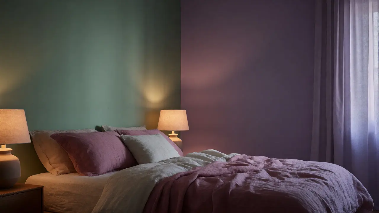
Your bedroom has one main job: help you recover. You want colors that signal safety and downtime. Soft blues, lavenders, and sage greens are classic choices because they mimic twilight and natural calming elements. Avoid high-energy reds or electric oranges unless you’re using them in tiny accents, like a throw pillow.
If you struggle with racing thoughts at night, try a muted teal. It combines the calm of blue with the balance of green. If you find cool tones too chilly, swap them for dusty rose or terracotta. These earthy tones provide warmth without the aggression of pure red. Remember, lighting plays a huge role here. A soft lavender wall under harsh LED lights looks different than under warm bulbs. Always test your paint choice in the actual lighting conditions of the room.
The Kitchen and Dining Area: Connection and Appetite
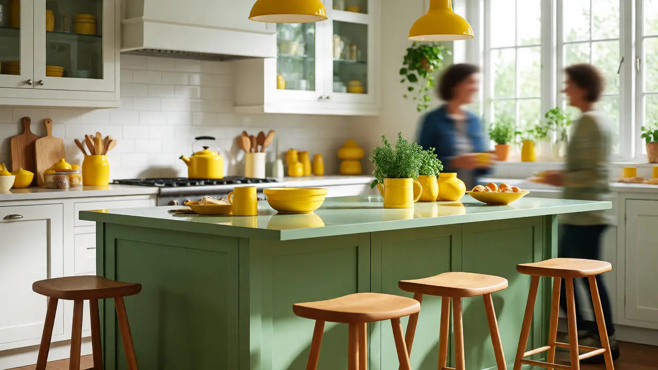
This is where you gather, eat, and talk. You want colors that encourage lingering. Yellow is famous for stimulating appetite and cheerfulness, but a full yellow kitchen can feel like a fast-food joint. Instead, use yellow in accessories or a single cabinet run. Pair it with white or wood tones to keep it sophisticated.
Greens work surprisingly well in kitchens because they connect food preparation with nature. Think herb gardens, fresh vegetables, and health. A sage green island against white cabinets feels fresh and organic. If you prefer a modern vibe, charcoal gray with metallic accents can make stainless steel appliances pop, though it requires good lighting to avoid feeling industrial.
The Home Office: Focus and Creativity
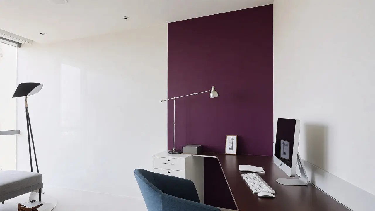
If you work from home, your office color impacts productivity. For analytical tasks, blues and grays help maintain concentration. They reduce visual noise and keep the mind steady. However, if your work involves brainstorming or design, you might need more stimulation. Purple has long been associated with creativity and problem-solving. A deep plum accent wall behind your desk can spark ideas without being distracting.
Don’t underestimate the power of white. It’s not just empty space; it’s clarity. A bright white office can feel expansive and clean, helping you clear mental clutter. Just ensure you add texture-rugs, plants, wooden furniture-so the space doesn’t feel clinical.
The Living Room: Social Interaction vs. Solitude
Is your living room primarily for hosting friends or for solo reading? If you host often, warm neutrals like beige, taupe, or soft orange create an inviting atmosphere. People naturally gravitate toward warmth when socializing. If you use the space mostly for decompressing alone, cooler tones like slate blue or forest green might feel more restorative.
Consider a two-tone approach. Paint the lower half of the walls in a darker, grounding color and the upper half in a lighter shade. This trick adds depth and can make a small room feel larger while keeping the mood balanced.
Beyond Paint: Textures and Lighting
Color isn’t just pigment. It’s also material. A velvet sofa in emerald green feels richer and more dramatic than a cotton shirt in the same hue. Texture changes how light reflects off a surface, which alters the perceived intensity of the color.
Lighting is the other critical variable. Natural light changes throughout the day. North-facing rooms receive cooler, bluer light, which can make warm colors look muddy. South-facing rooms get warmer, yellower light, which can intensify cool colors. Use artificial lighting to correct these biases. Warm bulbs (2700K-3000K) soften cool colors, while daylight bulbs (5000K+) enhance blues and whites.
When choosing a palette, think about the tactile experience too. Rough textures like jute rugs or linen curtains absorb light and mute colors, creating a cozy, understated vibe. Smooth surfaces like silk or polished metal reflect light, making colors appear brighter and more energetic.
Avoiding Common Color Mistakes
Even with good intentions, it’s easy to mess up. Here are the most frequent traps.
- Ignoring the Undertone: Every color has an underlying hue. A "white" might have pink, blue, or yellow undertones. Place your swatches next to your fixed elements (flooring, countertops) before deciding. A gray with a blue undertone will clash with beige flooring.
- Testing Only in Daylight: Paint looks different at night. Check your samples under your evening lamp settings. If the color disappears or looks muddy at night, it’s not the right choice.
- Overusing High Saturation: Fully saturated colors (pure red, pure blue) are intense. In large quantities, they overwhelm the senses. Desaturate them by adding gray or white. Pastels and muted tones are generally easier to live with long-term.
- Falling for Trends Too Hard: Millennial Pink was everywhere in 2018. Now it feels dated. Choose colors that resonate with your personal taste rather than Instagram trends. You’ll live with this color for years, not months.
Creating a Cohesive Flow
Your home shouldn’t feel like a series of disconnected boxes. Colors should flow from room to room. You don’t need to paint every wall the same color, but you should repeat key hues. Maybe your hallway features a specific blue trim that appears again in the bedroom bedding and the living room rug. This creates a subconscious sense of unity.
Use the 60-30-10 rule as a guideline. 60% of the room should be a dominant neutral color (walls, large furniture). 30% should be a secondary color (upholstery, curtains). 10% should be an accent color (pillows, art, decor). This ratio keeps the space balanced and prevents any single color from becoming overwhelming.
Remember, your home is a living entity. Your moods change, your life stages shift. Don’t be afraid to adjust. Start with permanent fixtures like floors and large furniture in timeless neutrals. Then, use easily changeable items like paint, textiles, and accessories to experiment with mood. This flexibility allows you to adapt your environment as your psychological needs evolve.
Ultimately, the best color scheme is the one that makes you feel like yourself. Trust your gut. If a color makes you smile, it’s working. If it makes you tense, change it. Your home is your biggest tool for self-care, so use color to build the mood you deserve.
What is the best color for reducing stress in a home?
Cool tones like soft blues, greens, and lavenders are widely considered the most effective for stress reduction. These colors are associated with nature and sky, triggering a physiological response that lowers heart rate and blood pressure. Sage green and pale blue are particularly popular for bedrooms and meditation spaces because they promote calmness without feeling cold.
Does color psychology differ for men and women?
While individual preference varies greatly, some studies suggest women may perceive color distinctions more finely due to genetic factors related to color vision. However, cultural conditioning also plays a massive role. Rather than strictly gendered preferences, focus on the psychological effects of the color itself-such as red for energy or blue for calm-and how those align with your personal temperament and daily activities.
How do I choose a paint color that matches my existing furniture?
Start by identifying the dominant colors in your fixed elements, such as flooring, countertops, or large upholstery. Bring a physical sample of these items to the paint store. Look for paint chips that share similar undertones. For example, if your floor has warm oak tones, choose paints with yellow or red undertones rather than blue ones. Always test large patches on the wall and observe them over 24 hours to see how they change with natural and artificial light.
Can too much white make a room feel cold?
Yes, excessive stark white can feel clinical and unwelcoming. To prevent this, introduce warmth through texture and accessories. Use wooden furniture, wool rugs, linen curtains, and indoor plants. Choosing a white with a warm undertone, such as cream, ivory, or beige, instead of a pure optical white, can also make the space feel cozier and more inviting while maintaining a bright, airy feel.
What colors are best for a small apartment?
Lighter colors generally make small spaces feel larger because they reflect more light. Soft pastels, light grays, and off-whites are excellent choices. However, don’t fear color entirely. A dark accent wall can add depth and drama without shrinking the room if balanced with lighter surrounding walls. Mirrors and glossy finishes can also enhance the sense of space by reflecting light and views.